Project Overview
Client: Miss Angel Etim (Programmer)
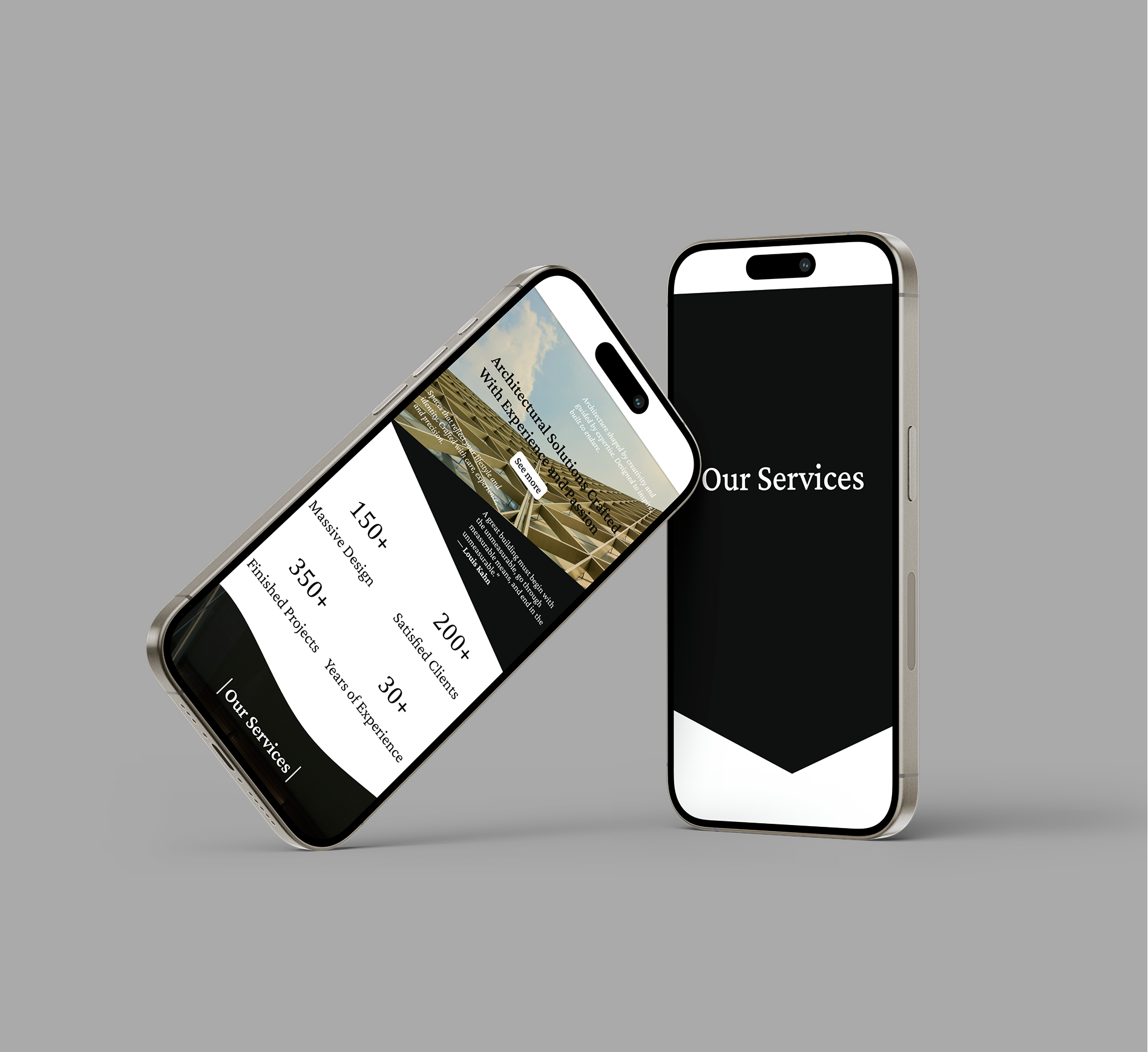
Industry: Web Analytics / SaaS
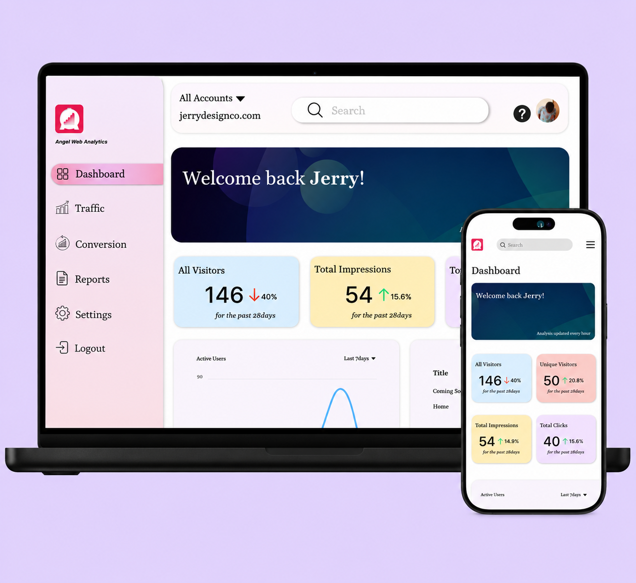
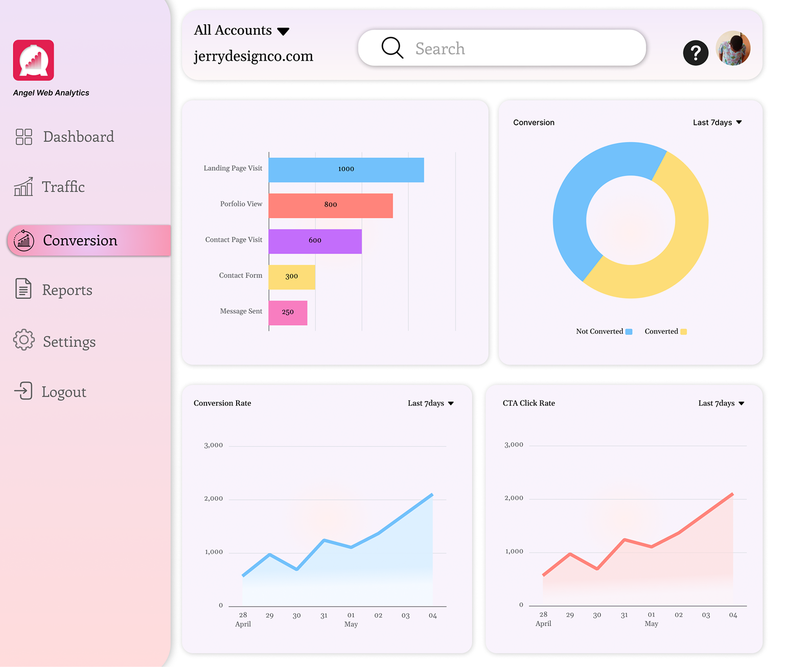
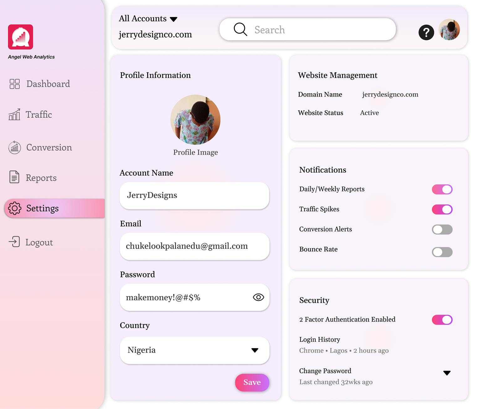
Project Type: Analytics Dashboard (UI/UX)
Role: UI/UX Design, Brand Positioning, Dashboard Structuring, User Experience
Strategy
Tools Used: Figma, Adobe Photoshop
Problem Statement
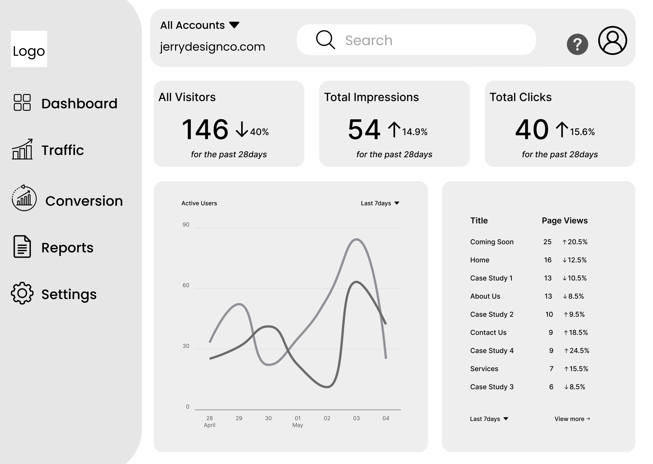
Many analytics platforms provide large amounts of data but often overwhelm users with complex layouts, excessive information, and poor visual hierarchy.
Miss Angel Etim (CEO of Angel Web Analytics) is a programmer who needed a dashboard experience that could:
- Present analytical data in a clean and understandable way
- Simplify navigation between reports and metrics
- Improve readability and visual organization
- Maintain a modern and premium visual identity
- Deliver a responsive experience across devices
While platforms like Google Analytics and Search Console are very good but their interfaces can sometimes feel complex for new users due to the amount of information displayed at once. Angel Web Analytics aimed to create a more visually simplified and user-friendly alternative focused on clarity and usability.
Goals & Objectives
The main objectives of the project were to:
- Create a modern and visually appealing analytics dashboard
- Build a clean and minimal user interface
- Improve data readability and organization
- Simplify user navigation and interactions
- Design a responsive dashboard for desktop and mobile users
- Increase usability for both beginners and professionals
Research & Discovery
User Research
Research was conducted on analytics dashboards and SaaS platforms to better
understand user expectations and behaviors.
The platform was designed for:
- Website owners
- Businesses
- Digital marketers
- Designers and Developers
- Content creators and bloggers
Key Insights
- Clean and organized dashboards
- Easy access to important metrics
- Simple navigation structures
- Real-time performance visibility
- Minimal interfaces with reduced clutter
- Mobile-friendly dashboard experiences